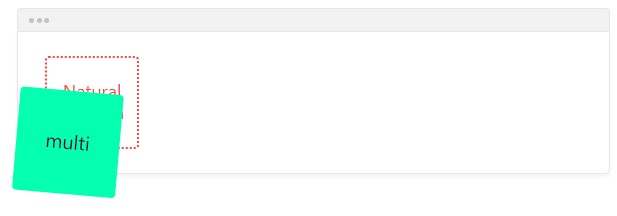
#Transform
Defines how the element is transformed.-
transform: none;
default Removes any transformation.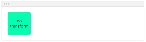
-
transform: translateX(40px);
Move the element on the horizontal axis..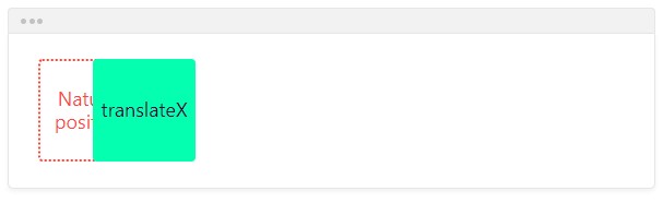
-
transform: translateY(20px);
Move the element on the vertical axis.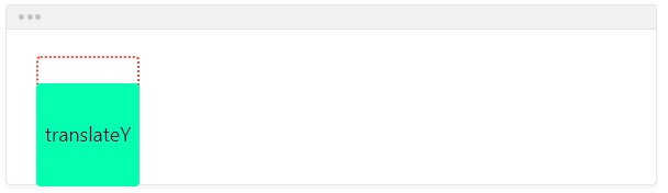
-
transform: translateY(100%);
You can use percentage values: the percentage is relative to the element itself, and not the parent.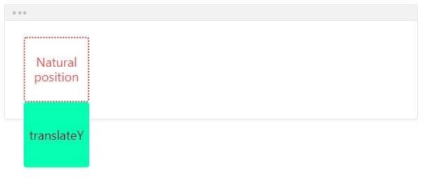
-
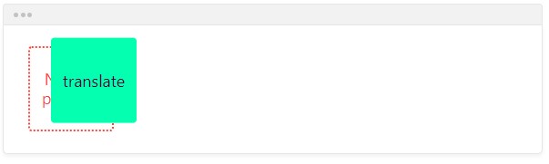
transform: translate(20px, -10%);
You can use translate() with two values:
- the first value is for the horizontal axis
- the second value is for the vertical axis
-
transform: scaleX(1.5);
Scale the element on the horizontal axis.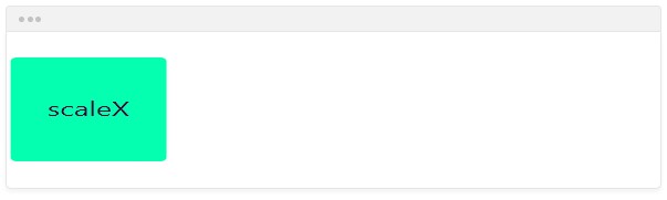
-
transform: scaleY(0.4);
Scale the element on the vertical axis.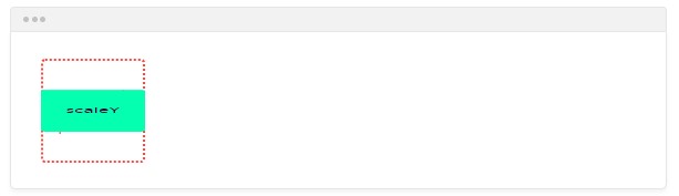
-
transform: scaleY(-2);
You can use negative values: it will invert the element.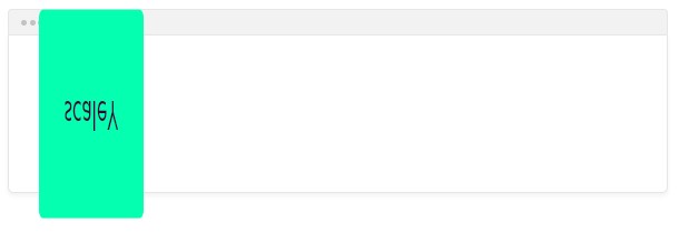
-
transform: scale(0.8, 0.8);
You can use scale() with two values:
- the first value is for the horizontal axis
- the second value is for the vertical axis
By using the same value for both, you can scale proportionally.
-
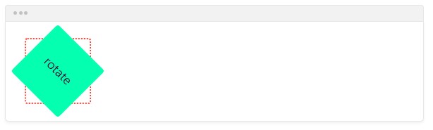
transform: rotate(45deg);
Rotate the element.
You can use:
- degrees from 0 to 360deg
- gradians from 0 to 400grad
- radians from 0 to 2πrad
- turns from 0 to 1turn
-
transform: skewX(15deg);
Skew the element on the horizontal axis.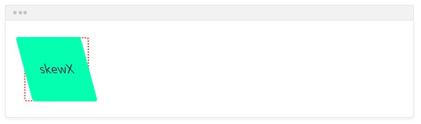
-
transform: skewY(45deg);
Skew the element on the vertical axis.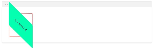
-
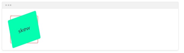
transform: skew(10deg, -20deg);
You can use skew() with two values:
- the first value is for the horizontal axis
- the second value is for the vertical axis
-
transform: rotate(5deg) scale(1.1, 1.1) translate(-20%, 30px);
You can combine multiple transformations by separating them with a space.